
Components
Components
The following are components supported by Form Builder.
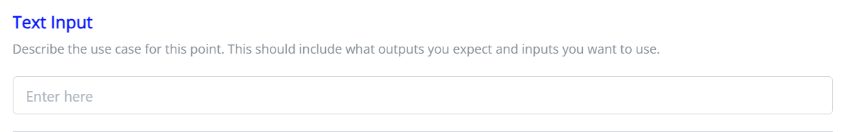
Text Input
The Text Input (text_input) component is designed for capturing textual information with validation.
Required properties
- id: The unique identifier to access the output value.
Optional properties
- title: The title for the Text Input.
- instructions: Guidelines for describing the use case, including expected inputs and desired outputs.
- default_value: Set a default value if needed.
- placeholder: Display a placeholder text within the text input.
- required: Indicates whether the text area is required, allowing empty values.
- one_of: An array of id's (the required field above) that at least one MUST have a value, otherwise all will fail validation
- reg_ex: Specifies the type of validation to be applied, for example
email,number,string,alphanumericor custom regular expression.
Outputs
The Text Input component captures and outputs the entered textual information.
Screenshot
Example
{
  "component_name": "form_builder",
  "pages": [
    {
      "header": "Create / edit an action",
      "instructions": "Fill out the form below to create or edit an action.",
      "fields": [
        {
          "id": "email",
          "title": "Email",
          "component": "text_input",
          "instructions": "Describe the use case for this point.  This should include what outputs you expect and inputs you want to use.",
          "required": true,
          "reg_ex": "email",
          "default_value": "[email protected]"
        }
      ]
    }
  ],
  "data_token": {
    "request.email": "email"
  }
}
Note: The example demonstrates the usage of the Text Input with the specified properties.
Text Area
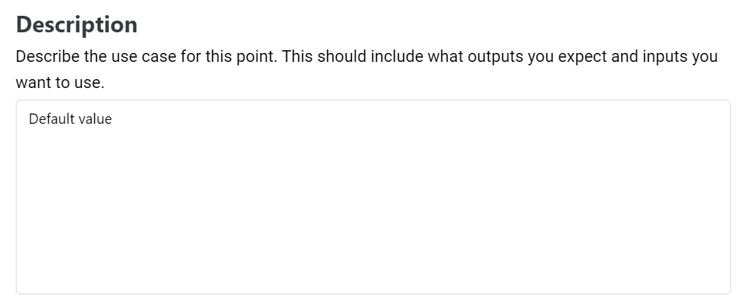
The Text Area (text_area) component is designed for capturing textual information in a point. It allows users to input and describe specific use cases.
Properties
To utilize the Text Area component in a point, include it with the following specifications:
- id: The unique identifier to access the output value
- title: The title for the text area.
- instructions: Guidelines for describing the use case, including expected inputs and desired outputs.
- default_value: Set a default value if needed.
- size: Specify the size of the markdown display as 'S' (4 lines), 'M' (8 lines), 'L' (16 lines), or 'auto' to fit content. Additionally, you can override these predefined sizes by providing any value, indicating the desired number of lines (3 or '3').
- max_height: Optional parameter to use with
size:autowith a default value of 'M' (8 lines) - allows the setting of a maximum height when 'auto' is used - has no effect if size 'auto' is not applied. If you wish for 'auto' to take up ALL vertical space necessary (no max-height) then set this to 'auto'. Available options are 'S' (4 lines), 'M' (8 lines), 'L' (16 lines), or 'auto' to fit content. Additionally, you can override these predefined sizes by providing any value, indicating the desired number of lines (3 or '3'). - placeholder: Display a placeholder text within the text area.
- required: Indicates whether the text area is required, allowing empty values.
Outputs
The Text Area component captures and outputs the entered textual information.
Screenshot
Example
{
  "component_name": "form_builder",
  "pages": [
    {
      "header": "Create / edit an action",
      "instructions": "Fill out the form below to create or edit an action.",
      "fields": [
        {
          "id": "description",
          "title": "Description",
          "component": "text_area",
          "instructions": "Describe the use case for this point.  This should include what outputs you expect and inputs you want to use.",
          "required": true,
          "size": "M",
          "default_value": "Default value"
        }
      ]
    }
  ],
  "data_token": {
    "request.description": "description"
  }
}
Note: The example demonstrates the usage of the Text Area with the specified properties
Select
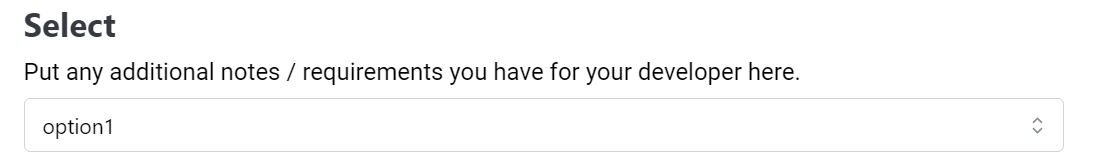
The Select (select) component provides a dropdown menu for users to choose from a list of options. It is ideal for scenarios where a single choice needs to be made from a predefined set.
Properties
To use the Select component, integrate it with the following properties:
- id: The unique identifier to access the selected value.
- title: The title for the select dropdown.
- instructions: Guidelines for describing the use case, including expected inputs and desired outputs.
- default_value: Set a default value if needed.
- options: An array of available options. (can also be a JSON Object for Cascading Options)
- required: Indicates whether a selection is mandatory, allowing empty values.
Outputs
The Select component outputs the selected value.
Screenshot
Example
{
  "component_name": "form_builder",
  "pages": [
    {
      "header": "Create / edit an action",
      "instructions": "Fill out the form below to create or edit an action.",
      "fields": [
        {
          "id": "select",
          "title": "Select",
          "component": "select",
          "instructions": "Put any additional notes / requirements you have for your developer here.",
          "required": true,
          "default_value": "option1",
          "options": [
            "option1",
            "option2"
          ]
        }
      ]
    }
  ],
  "data_token": {
    "request.select": "select"
  }
}
Note: The example demonstrates the usage of the Select component with the specified properties.
Multiselect
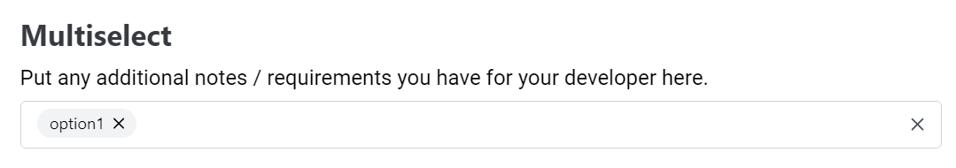
The Multiselect (multiselect) component allows users to make multiple selections from a list of options. It is suitable for scenarios where more than one choice can be made.
Properties
To use the Multiselect component, integrate it with the following properties:
- id: The unique identifier to access the selected values.
- title: The title for the multiselect dropdown.
- instructions: Guidelines for describing the use case, including expected inputs and desired outputs.
- default_value: Set default values if needed.
- options: An array of available options. (can also be a JSON Object for Cascading Options). The options may also be an object of the format
{ "label": "Required Label", "value": "Required Value", "description": "Optional Description" }or if you wish to 'group' options you may also provide options in the format{group: 'Group label', items: [{value: 'Required Value', label: 'Required Label', description: 'Optional Description'}]} - required: Indicates whether a selection is mandatory, allowing empty values.
- output: Specifies the format of the output, either as an
Array- an array of values or asKeys- an array of key-value pairs.
Outputs
The Multiselect component outputs the selected values in the specified format.
Output Format: Array
If the output format is set to "Array," the output will be an array of selected values, for example: ["option1", "option2"].
Output Format: Keys
If the output format is set to "Keys," the output will be an array of key-value pairs indicating the selected options, for example: [{"option1": true}, {"option2": true}].
Screenshot
Example
{
  "component_name": "form_builder",
  "pages": [
    {
      "header": "Create / edit an action",
      "instructions": "Fill out the form below to create or edit an action.",
      "fields": [
        {
          "id": "multiselect",
          "title": "Multiselect",
          "component": "multiselect",
          "instructions": "Put any additional notes / requirements you have for your developer here.",
          "required": true,
          "default_value": [
            "option1"
          ],
          "output": "Array",
          "options": [
            "option1",
            "option2"
          ]
        }
      ]
    }
  ],
  "data_token": {
    "request.multiselect": "multiselect"
  }
}
Note: The example demonstrates the usage of the Multiselect component with the specified properties.
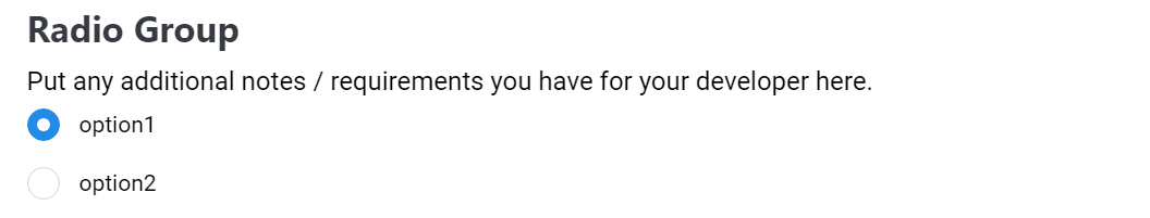
Radio Group
The Radio Group (radio_group) component allows users to make a single selection from a list of radio options. It is suitable for scenarios where only one choice is allowed.
Properties
To use the Radio Group component, integrate it with the following properties:
- id: The unique identifier to access the selected value.
- title: The title for the radio group.
- instructions: Guidelines for describing the use case, including expected inputs and desired outputs.
- default_value: Set a default value if needed.
- options: An array of radio options, each with a value and label.
- You may include an optional
groupproperty to group radio options together using the form{ label: 'Group Label', 'description': 'Optional Group Description' }. If at least one description is included, then any ungrouped radio options will be displayed in a group called 'Other' at the bottom of all options. If descriptions have a mis-match within the same group - the last description will be used. - You can also include an optional
descriptionproperty to add a small description tag line below the option - for user clarity. (can also be a JSON Object for Cascading Options)
- You may include an optional
- required: Indicates whether a selection is mandatory, allowing empty values.
- read_only: (Optional) Set to true to make the component read-only - this disables the inputs and user interactions
- sorted: (Optional) Set to 'ascending' or 'descending' to sort the options and option groups (if present).
- sort_by: (Optional) An array of strings to sort the options and option groups (if present). Supports nested properties such as 'group.label' to sort by various attached properties. Any sort prefixed with 'group.' will not only sort the options, but also be used for sorting the option groups as well by the rule outlined in the
sortedproperty.
Outputs
The Radio Group component outputs the selected value.
Screenshot
Example
{
  "component_name": "form_builder",
  "pages": [
    {
      "header": "Create / edit an action",
      "instructions": "Fill out the form below to create or edit an action.",
      "fields": [
        {
          "id": "radio_group",
          "title": "Radio Group",
          "component": "radio_group",
          "instructions": "Put any additional notes / requirements you have for your developer here.",
          "required": true,
          "default_value": "option1",
          "options": [
            {
              "value": "option1",
              "label": "option1",
              "description": "Optional description"
            },
            {
              "value": "option2",
              "label": "option2"
            },
            {
              "group": {
                "label": "Group Label",
                "description": "Optional Group Description"
              }
              "value": "option2",
              "label": "option2"
            }
          ]
        }
      ]
    }
  ],
  "data_token": {
    "request.radio_group": "radio_group"
  }
}
Note: The example demonstrates the usage of the Radio Group component with the specified properties.
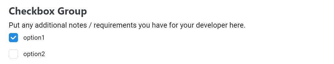
Checkbox Group
The Checkbox Group (checkbox_group) component allows users to make multiple selections from a list of checkboxes. It is suitable for scenarios where more than one choice can be made.
Properties
To use the Checkbox Group component, integrate it with the following properties:
- id: The unique identifier to access the selected values.
- title: The title for the checkbox group.
- instructions: Guidelines for describing the use case, including expected inputs and desired outputs.
- default_value: Set default values if needed.
- options: An array of checkbox options, each with a value and label. You can also include an optional
descriptionproperty to add a small description tag line below the option - for user clarity. - required: Indicates whether a selection is mandatory, allowing empty values.
- output: Specifies the format of the output, either as an
Array- an array of values or asKeys- an array of key-value pairs. (can also be a JSON Object for Cascading Options) - read_only: Set to true to make the component read-only - this disables the inputs and user interactions
Outputs
The Checkbox Group component outputs the selected values in the specified format.
Output Format: Array
If the output format is set to "Array," the output will be an array of selected values, for example: ["option1", "option2"].
Output Format: Keys
If the output format is set to "Keys," the output will be an array of key-value pairs indicating the selected options, for example: [{"option1": true}, {"option2": true}].
Screenshot
Example
{
  "component_name": "form_builder",
  "pages": [
    {
      "header": "Create / edit an action",
      "instructions": "Fill out the form below to create or edit an action.",
      "fields": [
        {
          "id": "checkbox_group",
          "title": "Checkbox Group",
          "component": "checkbox_group",
          "instructions": "Put any additional notes / requirements you have for your developer here.",
          "required": true,
          "default_value": [
            "option1"
          ],
          "output": "Keys",
          "options": [
            {
              "value": "option1",
              "label": "option1",
              "description": "Optional description"
            },
            {
              "value": "option2",
              "label": "option2"
            }
          ]
        }
      ]
    }
  ],
  "data_token": {
    "request.checkbox_group": "checkbox_group"
  }
}
Note: The example demonstrates the usage of the Checkbox Group component with the specified properties.
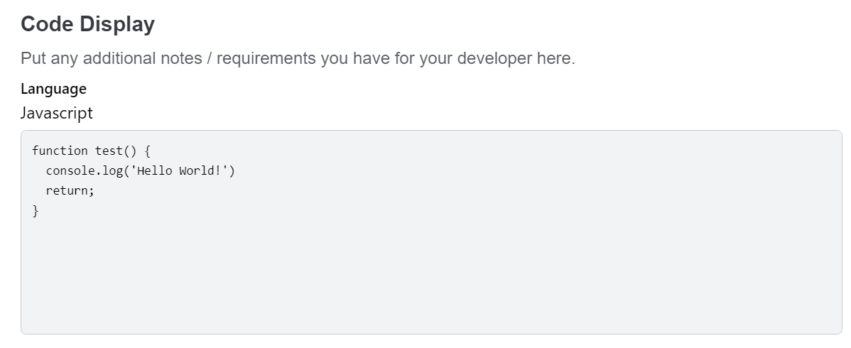
Code Display
The Code Display (code_display) component is designed for rendering and displaying code snippets. It is useful for showcasing code examples or providing a visual representation of code.
Properties
To use the Code Display component, integrate it with the following properties:
- id: Component unique identifier.
- title: The title for the code display.
- instructions: Guidelines for describing the use case, including expected inputs.
- default_value: Set code snippet to be displayed.
- language: The programming language of the code snippet.
- size: Specify the size of the markdown display as 'S' (4 lines), 'M' (8 lines), 'L' (16 lines), or 'auto' to fit content. Additionally, you can override these predefined sizes by providing any value, indicating the desired number of lines (3 or '3').
- max_height: Optional parameter to use with
size:autowith a default value of 'M' (8 lines) - allows the setting of a maximum height when 'auto' is used - has no effect if size 'auto' is not applied. If you wish for 'auto' to take up ALL vertical space necessary (no max-height) then set this to 'auto'. Available options are 'S' (4 lines), 'M' (8 lines), 'L' (16 lines), or 'auto' to fit content. Additionally, you can override these predefined sizes by providing any value, indicating the desired number of lines (3 or '3').
Outputs
None
Screenshot
Example
{
  "component_name": "form_builder",
  "pages": [
    {
      "header": "Create / edit an action",
      "instructions": "Fill out the form below to create or edit an action.",
      "fields": [
        {
          "id": "code_display",
          "title": "Code Display",
          "component": "code_display",
          "instructions": "Put any additional notes / requirements you have for your developer here.",
          "default_value": "function test() {\n  console.log('Hello World!');\n  return;\n}",
          "size": "M",
          "language": "Javascript"
        }
      ]
    }
  ],
  "data_token": {}
}
Note: The example demonstrates the usage of the Code Display component with the specified properties.
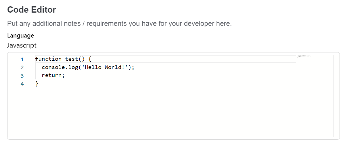
Code Editor
The Code Editor (code_editor) component allows to edit and visualize code snippets.
Properties
To use the Code Editor component, integrate it with the following properties:
- id: The unique identifier to access the output.
- title: The title for the code editor.
- instructions: Guidelines for describing the use case, including expected inputs and desired outputs.
- default_value: Set a default code snippet if needed.
- language: The programming language of the code snippet.
- size: Specify the size of the markdown display as 'S' (4 lines), 'M' (8 lines), 'L' (16 lines), or 'auto' to fit content. Additionally, you can override these predefined sizes by providing any value, indicating the desired number of lines (3 or '3').
- max_height: Optional parameter to use with
size:autowith a default value of 'M' (8 lines) - allows the setting of a maximum height when 'auto' is used - has no effect if size 'auto' is not applied. If you wish for 'auto' to take up ALL vertical space necessary (no max-height) then set this to 'auto'. Available options are 'S' (4 lines), 'M' (8 lines), 'L' (16 lines), or 'auto' to fit content. Additionally, you can override these predefined sizes by providing any value, indicating the desired number of lines (3 or '3'). - required: Indicates whether code content needed, allowing empty values.
Outputs
The Code Editor component outputs the edited code content.
Screenshot
Example
{
  "component_name": "form_builder",
  "pages": [
    {
      "header": "Create / edit an action",
      "instructions": "Fill out the form below to create or edit an action.",
      "fields": [
        {
          "id": "code_editor",
          "title": "Code Editor",
          "component": "code_editor",
          "instructions": "Put any additional notes / requirements you have for your developer here.",
          "default_value": "function test() {\n  console.log('Hello World!');\n  return;\n}",
          "size": "M",
          "language": "Javascript",
          "required": true
        }
      ]
    }
  ],
  "data_token": {
    "request.code_editor": "code_editor"
  }
}
Note: The example demonstrates the usage of the Code Editor component with the specified properties.
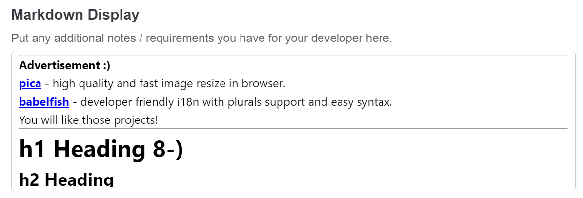
Markdown Display
The Markdown Display (markdown_display) component allows to view formatted Markdown content. It supports various Markdown features for text styling and structuring.
Properties
To use the Markdown Display component, integrate it with the following properties:
- id: Component unique identifier.
- title: The title for the markdown display.
- instructions: Guidelines for describing the use case, including expected inputs and desired outputs.
- default_value: The default Markdown content to be displayed, if needed.
- size: Specify the size of the markdown display as 'S' (4 lines), 'M' (8 lines), 'L' (16 lines), or 'auto' to fit content. Additionally, you can override these predefined sizes by providing any value, indicating the desired number of lines (3 or '3').
- max_height: Optional parameter to use with
size:autowith a default value of 'M' (8 lines) - allows the setting of a maximum height when 'auto' is used - has no effect if size 'auto' is not applied. If you wish for 'auto' to take up ALL vertical space necessary (no max-height) then set this to 'auto'. Available options are 'S' (4 lines), 'M' (8 lines), 'L' (16 lines), or 'auto' to fit content. Additionally, you can override these predefined sizes by providing any value, indicating the desired number of lines (3 or '3').
Outputs
None
Screenshot
Example
{
  "component_name": "form_builder",
  "pages": [
    {
      "header": "Create / edit an action",
      "instructions": "Fill out the form below to create or edit an action.",
      "fields": [
        {
          "id": "markdown_display",
          "title": "Markdown Display",
          "component": "markdown_display",
          "instructions": "Put any additional notes / requirements you have for your developer here.",
          "size": "S",
          "default_value": "**Test** *markdown* display ~~component~~"
        }
      ]
    }
  ],
  "data_token": {}
}
Note: The example demonstrates the usage of the Markdown Display component with the specified properties.
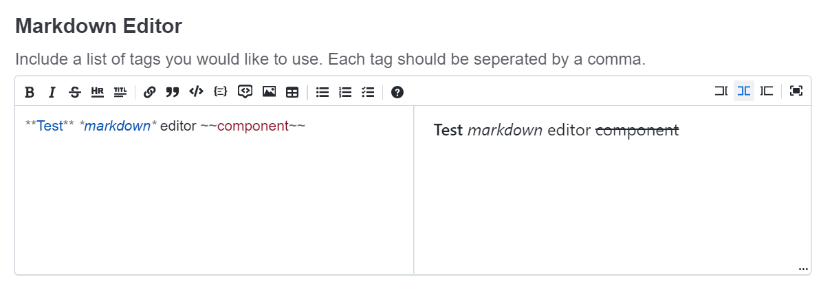
Markdown Editor
The Markdown Editor (markdown_editor) component allows to compose and edit Markdown text with real-time preview.
Properties
To use the Markdown Display component, integrate it with the following properties:
- id: The unique identifier to access the output.
- title: The title for the markdown editor.
- instructions: Guidelines for describing the use case, including expected inputs and desired outputs.
- default_value: The default Markdown content to be displayed, if needed.
- size: Specify the size of the markdown display as 'S' (4 lines), 'M' (8 lines), 'L' (16 lines), or 'auto' to fit content. Additionally, you can override these predefined sizes by providing any value, indicating the desired number of lines (3 or '3').
- max_height: Optional parameter to use with
size:autowith a default value of 'M' (8 lines) - allows the setting of a maximum height when 'auto' is used - has no effect if size 'auto' is not applied. If you wish for 'auto' to take up ALL vertical space necessary (no max-height) then set this to 'auto'. Available options are 'S' (4 lines), 'M' (8 lines), 'L' (16 lines), or 'auto' to fit content. Additionally, you can override these predefined sizes by providing any value, indicating the desired number of lines (3 or '3'). - required: Indicates whether the Markdown content is mandatory.
Outputs
The Markdown Editor component outputs the edited Markdown content.
Screenshot
Example
{
  "component_name": "form_builder",
  "pages": [
    {
      "header": "Create / edit an action",
      "instructions": "Fill out the form below to create or edit an action.",
      "fields": [
        {
          "id": "markdown_editor",
          "title": "Markdown Editor",
          "component": "markdown_editor",
          "instructions": "Include a list of tags you would like to use. Each tag should be seperated by a comma.",
          "default_value":  "**Test** *markdown* editor ~~component~~",
          "size": "L",
          "required": true
        }
      ]
    }
  ],
  "data_token": {
    "request.markdown_editor": "markdown_editor"
  }
}
Note: The example demonstrates the usage of the Markdown Editor component with the specified properties.
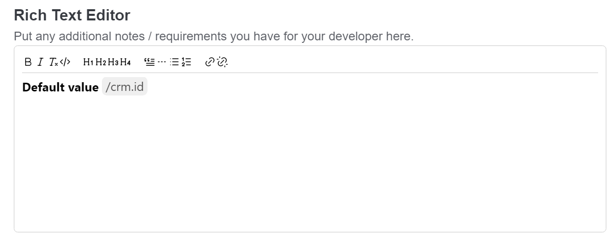
Rich Text Editor
The Rich Text Editor (rich_text_editor) component provides a feature-rich editing experience for text content. It supports token paths as suggestions, allowing users to insert predefined token paths into the text.
Properties
To use the Rich Text Editor component, integrate it with the following properties:
- id: The unique identifier to access the edited text content.
- title: The title for the Rich Text Editor.
- instructions: Guidelines for describing the use case, including expected inputs and desired outputs.
- default_value: The default text content to be displayed in the editor.
- size: Specify the size of the markdown display as 'S' (4 lines), 'M' (8 lines), 'L' (16 lines), or 'auto' to fit content. Additionally, you can override these predefined sizes by providing any value, indicating the desired number of lines (3 or '3').
- max_height: Optional parameter to use with
size:autowith a default value of 'M' (8 lines) - allows the setting of a maximum height when 'auto' is used - has no effect if size 'auto' is not applied. If you wish for 'auto' to take up ALL vertical space necessary (no max-height) then set this to 'auto'. Available options are 'S' (4 lines), 'M' (8 lines), 'L' (16 lines), or 'auto' to fit content. Additionally, you can override these predefined sizes by providing any value, indicating the desired number of lines (3 or '3'). - required: Indicates whether the text content is mandatory.
- suggestions: An object containing predefined token paths for suggestions. Users can press / to input a token path within the text.
Outputs
The Rich Text Editor component outputs the edited text content.
Screenshot
Example
{
  "component_name": "form_builder",
  "pages": [
    {
      "header": "Create / edit an action",
      "instructions": "Fill out the form below to create or edit an action.",
      "fields": [
        {
          "id": "rich_text_editor",
          "title": "Rich Text Editor",
          "component": "rich_text_editor",
          "instructions": "Put any additional notes / requirements you have for your developer here.",
          "required": true,
          "default_value": "Default value",
          "size": "M",
          "suggestions": {
            "crm": {
              "id": "id",
              "integration": "_integration"
            }
          }
        }
      ]
    }
  ],
  "data_token": {
    "request.rich_text_editor": "rich_text_editor"
  }
}
Note: The example demonstrates the usage of the Rich Text Editor component with the specified properties.
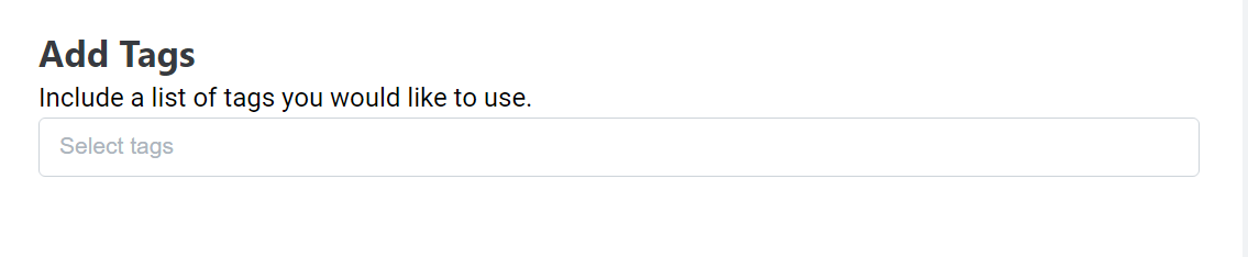
Select Tags
Select Tags (select_tags) component allows users to efficiently select multiple tags from a predefined list. It features dynamic suggestion capabilities, search functionality, and the option to include custom tags.
Properties
To use the Select tags component, integrate it with the following properties:
- id: The unique identifier to access the edited text content.
- title: The title for the Rich Text Editor.
- instructions: Guidelines for describing the use case, including expected inputs and desired outputs.
- default_value: The default text content to be displayed in the editor (e.g.["melodyarc"]).
- options: An array of suggested list of tags for users to choose from (e.g.["shopify", "melodyarc"]).
- allow_custom: A flag to determine whether users can enter custom tags not present in the suggestion list.
Outputs
The Select Tags component outputs the selected tags as an array of strings.
Screenshot
Example
{
  "component_name": "form_builder",
  "pages": [
    {
      "header": "Create / edit an action",
      "instructions": "Fill out the form below to create or edit an action.",
      "fields": [
        {
          "id": "select_tags",
          "title": "Add Tags",
          "component": "select_tags",
          "instructions": "Include a list of tags you would like to use.",
          "default_value": ["Default value"],
          "options": ["Ecommerce", "melodyarc"],
          "allow_custom": true
        }
      ]
    }
  ],
  "data_token": {
    "request.select_tags": "select_tags"
  }
}
Note: The example demonstrates the usage of the Select Tags component with the specified properties.
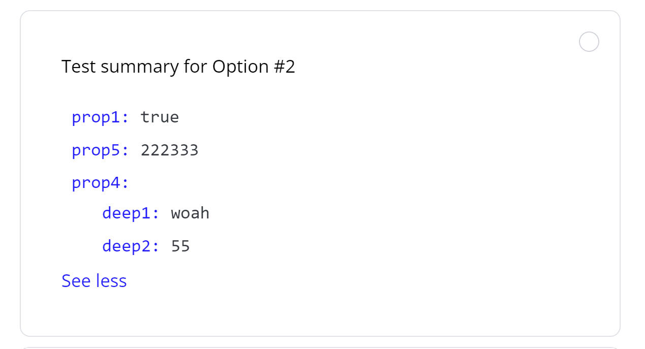
Select JSON
Select JSON (select_json) component allows users to efficiently select one out of several JSON options. It also supports the ability to include a 'summary' as a top level property in the JSON options you provide which will be removed from the label and placed in a human friendly text area should you wish to summarize the overall data. This component also has a Spoiler function that will display S/M/L (4/8/16 lines) or a pixel height as provided by the user as a preview. When a summary is provided there is no preview, but the spoiler is still there that toggles the full display of the json in the option.
Properties
To use the Select JSON component, integrate it with the following properties:
- title: The title for the Rich Text Editor.
- instructions: Guidelines for describing the use case, including expected inputs and desired outputs.
- options: An array of json objects that are the options to choose - optionally include 'summary' as top level key
- size: A pixel height, 'auto' to fit height automatically, or 'S'/'M'/'L' (4/8/16 lines) option to set the initial height of the spoiler/teaser
- max_height: Optional parameter to use with
size:autowith a default value of 'M' (8 lines) - allows the setting of a maximum height when 'auto' is used - has no effect if size 'auto' is not applied. If you wish for 'auto' to take up ALL vertical space necessary (no max-height) then set this to 'auto'. Available options are 'S' (4 lines), 'M' (8 lines), 'L' (16 lines), or 'auto' to fit content. Additionally, you can override these predefined sizes by providing any value, indicating the desired number of lines (3 or '3').
Outputs
The Select JSON component outputs the selected json object.
Screenshot
Example
{
  "component_name": "form_builder",
  "pages": [
    {
      "header": "Create / edit an action",
      "instructions": "Fill out the form below to create or edit an action.",
      "fields": [
        {
          "id": "select_json",
          "title": "Add Tags",
          "component": "select_json",
          "instructions": "Include a list of tags you would like to use.",
          "options": [{
            summary: "Test summary for Option #2",
            prop1: true,
            prop5: 222333,
            prop4: {
              deep1: "woah",
              deep2: 55,
            },
          }],
        }
      ]
    }
  ],
  "data_token": {
    "request.select_json": "select_json"
  }
}
Note: The example demonstrates the usage of the Select Tags component with the specified properties.
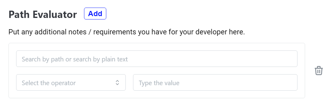
Path Evaluator
The Path Evaluator (path_evaluator) component is designed for creating conditions to evaluate paths.
Properties
To utilize the Path Evaluator component in a point, include it with the following specifications:
Required properties:
- id: The unique identifier to access the output value.
- paths: An object containing predefined paths with their corresponding data.
Optional properties:
- title: The title for the Path Evaluator.
- instructions: Guidelines for describing the use case, including expected inputs and desired outputs.
- default_value: Predefined paths with corresponding evaluation conditions.
- required: Indicates whether selection is required, allowing empty values.
- allow_custom: A flag that allows users to manually enter new paths.
Outputs
The Path Evaluator component captures and outputs the selected paths and evaluation condition.
{
  <path>: {
    "evaluate": "<operator><value>" | boolean
  }
}
Screenshot
Example
{
  "component_name": "form_builder",
  "pages": [
    {
      "header": "Create / edit an action",
      "instructions": "Fill out the form below to create or edit an action.",
      "fields": [
        {
          "id": "path_evaluator",
          "title": "Path Evaluator",
          "component": "path_evaluator",
          "instructions": "Put any additional notes / requirements you have for your developer here.",
          "required": true,
          "default_value": {
            "crm.id": {
              "evaluate": "=12345"
            },
            "crm.uri": {
              "evaluate": true
            }
          },
          "allow_custom": true,
          "paths": {
            "crm": {
              "id": 95628904,
              "uri": "/api/tickets/jk/",
              "external_id": null,
              "events": [],
              "status": "closed",
              "from_agent": false,
              "spam": true
            }
          }
        }
      ]
    }
  ],
  "data_token": {
    "request.path_evaluator": "path_evaluator"
  }
}
Note: The example demonstrates the usage of the Path Evaluator with the specified properties
Path Map
The Path Map (path_map) component is designed to create mappings between different paths.
Properties
To utilize the Path Map component in a point, include it with the following specifications:
Required properties:
- id: The unique identifier to access the output value.
- paths: An object containing predefined paths with their corresponding data.
Optional properties:
- title: The title for the Path Map.
- instructions: Guidelines for describing the use case, including expected inputs and desired outputs.
- allow_custom: A flag that allows users to manually enter new paths.
- default_value: Predefined paths with corresponding path mappings.
- required: Indicates whether selection is required, allowing empty values.
Outputs
The Path Map component captures and outputs the selected path mappings.
{
  <destination>: <source>
}
Screenshot
Example
{
  "component_name": "form_builder",
  "pages": [
    {
      "header": "Create / edit an action",
      "instructions": "Fill out the form below to create or edit an action.",
      "fields": [
        {
          "id": "path_map",
          "title": "Path Map",
          "component": "path_map",
          "instructions": "Put any additional notes / requirements you have for your developer here.",
          "required": true,
          "default_value": {
            "crm.id": "crm.uri"
          },
          "allow_custom": true,
          "paths": {
            "crm": {
              "id": 95628904,
              "uri": "/api/tickets/jk/",
              "external_id": null,
              "events": [],
              "status": "closed",
              "from_agent": false,
              "spam": true
            }
          }
        }
      ]
    }
  ],
  "data_token": {
    "request.path_map": "path_map"
  }
}
Note: The example demonstrates the usage of the Path Map with the specified properties
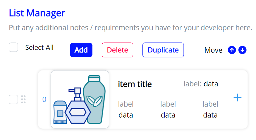
List Manager
The List Manager (list_manager) component is designed for order selection and subscription management, providing a unified user experience
Properties
To utilize the List Manager component in a point, include it with the following specifications:
Required properties:
- id: The unique identifier to access the output value.
Optional properties:
- title: The title for the List Manager.
- instructions: Guidelines for describing the use case, including expected inputs and desired outputs.
- default_value: Predefined list items with associated information.
- sortable: Indicates whether items can be sorted.
- required: Indicates whether selection is required, allowing empty values.
List item properties
- id: A unique identifier for the selected item within the List Manager.
- imageUrl: The URL of the image associated with the selected item.
- title: The title for the item.
- metaData: An object containing metadata information with a label and corresponding data.
- infoPanel1, infoPanel2, infoPanel3: Objects representing different panels of information associated with the item. Each panel includes a label and corresponding data.
- component: A configuration for additional components or actions related to the item to include information not displayed.
- output: Captures outputs of the component configuration specified.
Outputs
The List Manager component captures and outputs the list of items.
Screenshot
Example
{
  "component_name": "form_builder",
  "pages": [
    {
      "header": "Create / edit an action",
      "instructions": "Fill out the form below to create or edit an action.",
      "fields": [
        {
          "id": "list_manager",
          "title": "List Manager",
          "component": "list_manager",
          "instructions": "Put any additional notes / requirements you have for your developer here.",
          "required": true,
          "default_value": [
            {
              "id": "<id>",
              "imageUrl": "<item_image_url>",
              "title": "<item_title>",
              "metaData": {
                "label": "<meta_data_label>",
                "data": "<meta_data>"
              },
              "infoPanel1": {
                "label": "<info_panel1_label>",
                "data": "<info_panel1_data>"
              },
              "infoPanel2": {
                "label": "<info_panel2_label>",
                "data": "<info_panel2_data>"
              },
              "infoPanel3": {
                "label": "<info_panel3_label>",
                "data": "<info_panel3_data>"
              },
              "component": {
                component_name: 'form_builder',
                pages: [
                  {
                    header: 'Create / edit an action',
                    instructions: 'Fill out the form below to create or edit an action.',
                    fields: [
                      {
                        id: 'date',
                        title: 'Date',
                        component: 'date',
                        instructions: 'Describe the use case for this point.  This should include what outputs you expect and inputs you want to use.',
                        default_value: '01/01/1999',
                        required: true,
                      }
                    ],
                  },
                ],
                data_token: {
                  'request.date': 'date'
                }
              }
            }
          ],
          "sortable": true
        }
      ]
    }
  ],
  "data_token": {
    "request.list_manager": "list_manager"
  }
}
Note: The example demonstrates the usage of the List Manager with the specified properties
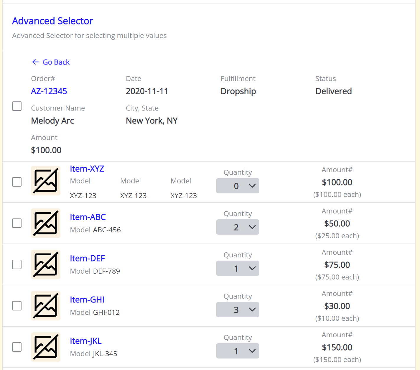
Advanced Selector
The Advanced Selector (advanced_selector) component is designed for complex selection scenarios - involving selection elements that are composed of children items which can have various and complex detail information to present to users. Users can then select entire selections OR individual items across multiple selections. (An example would be selections of orders that each contain 1 or more items.
Properties
To utilize the Advanced Selector component in a point, include it with the following specifications:
Required properties:
- id: The unique identifier to access the output value.
- value_format: the value provided and returned by the Advanced Selector can be either
shortoffull.- Each selection + item needs to be identified by creating a unique_id of
selection.value||item.value shortthe value (and default_value) is expected to be in the format of an Array of strings.- Ex: ['selection_123||item_abc', 'selection_123||item_def', 'selection_456||item_hgi', ...]
fullthe value (and default_value) is expected to be in the format of an Array of JSON objects.- Ex: [
{ id: 'selection_123||item_abc', quantity: 1},
{ id: 'selection_123||item_def'},
{ id: 'selection_456||item_hgi'},
...][
{ id: 'selection_123||item_abc', quantity: 1},
{ id: 'selection_123||item_def'},
{ id: 'selection_456||item_hgi'},
...]
- Ex: [
- Each selection + item needs to be identified by creating a unique_id of
- selections: this is an array of JSON objects that define the
selection- and it's childitems
Optional properties:
- title: The title for the Advanced Selector.
- instructions: Guidelines for describing the use case, including expected inputs and desired outputs.
- default_value: Predefined list items with associated information.
- required: Indicates whether selection is required, allowing empty values.
Selection properties
- value: this is a required unique value to identify your selection - ex: order#, shipment#, etc...
- selection_display_elements: this is a required array of JSON objects that define the informational
elementsof the selection list view - items: a required array of JSON objects that define each
itemcontained within the parent selection
Item properties
- value: this is a required unique value to identify your item - ex: SKU, serial number, etc...
- item_display_elements: this is a required array of JSON objects that define the informational
elementsof the item list view - item_details: this is an optional array of JSON objects that define the
detailsof an item
Item Details properties
- name: A required string - should be human readable/friendly - it defines the detail tab name
- detail_markdown: A required string that contains the markdown that is to be displayed to a user on this detail tab
Display Elements
Display elements are defined UI elements to display information to the users. Display elements either fit into sections, items and in some cases - both! A display element is defined by a JSON object containing the properties that will allow for the dynamic display of information.
Section Display Elements: Selection display rows are laid out in a 4 column grid that will wrap and generate extra rows as needed to accommodate the elements provided.
Item Display Elements: Item display rows are a flex layout that ignores column_width and instead fills the available row space with the item_display_elements provided.
-
Item Image - used to display an image in a 50x50 section of the item display row

-
Properties:
- type: "image"
- "image_url": "https://..." (string with the image url)
-
Header With Details - used to display a header/headline for the item - and then up to 3 additional details related to the item
- Properties:
- type: "header_with_details"
- header: "Test Header" (string with header contents)
- detail_1: This is a JSON object that defines the label (key) and value that goes with the label
- detail_2: This is a JSON object that defines the label (key) and value that goes with the label
- detail_3: This is a JSON object that defines the label (key) and value that goes with the label
- example detail:
- key: "Model" (string for the label)
- value: "S-23-X" (string for the value)
- Properties:
-
Quantity Selector - used to allow the display and adjustment of quantity (via a selector dropdown) associated with an item
- Properties:
- type: "quantity_selector"
- quantity: "5" (the default quantity associated with the item)
- quantity_options: ["0", "1", "2", ...] - an array of options to present the user for quantity selection
- Properties:
Universal Display Elements
-
-
Label Value - used to display a customized label with an associated value and sub-value. Also allows the value to pick a
text_shadeto emphasize the value if desired.
- Properties:
- type: "value_label"
- label: "Test Label" (string that sets the label)
- value: "Test Value" (string that sets the value)
- sub_value: "Test SubValue" (string that sets the sub_value)
- column_width: 1 (number to set the columns used on a selection display row
- column_align: "left" (string to set the alignment of the component - "left" "right" "center"
- Properties:
Outputs
The Advanced Selector component captures and outputs the list of selection-items in either the short or full format as designated by the value_format property.
Screenshot
Selection List view (list of all available selections)
Items List view within a single Selection (list of available items inside the selection)
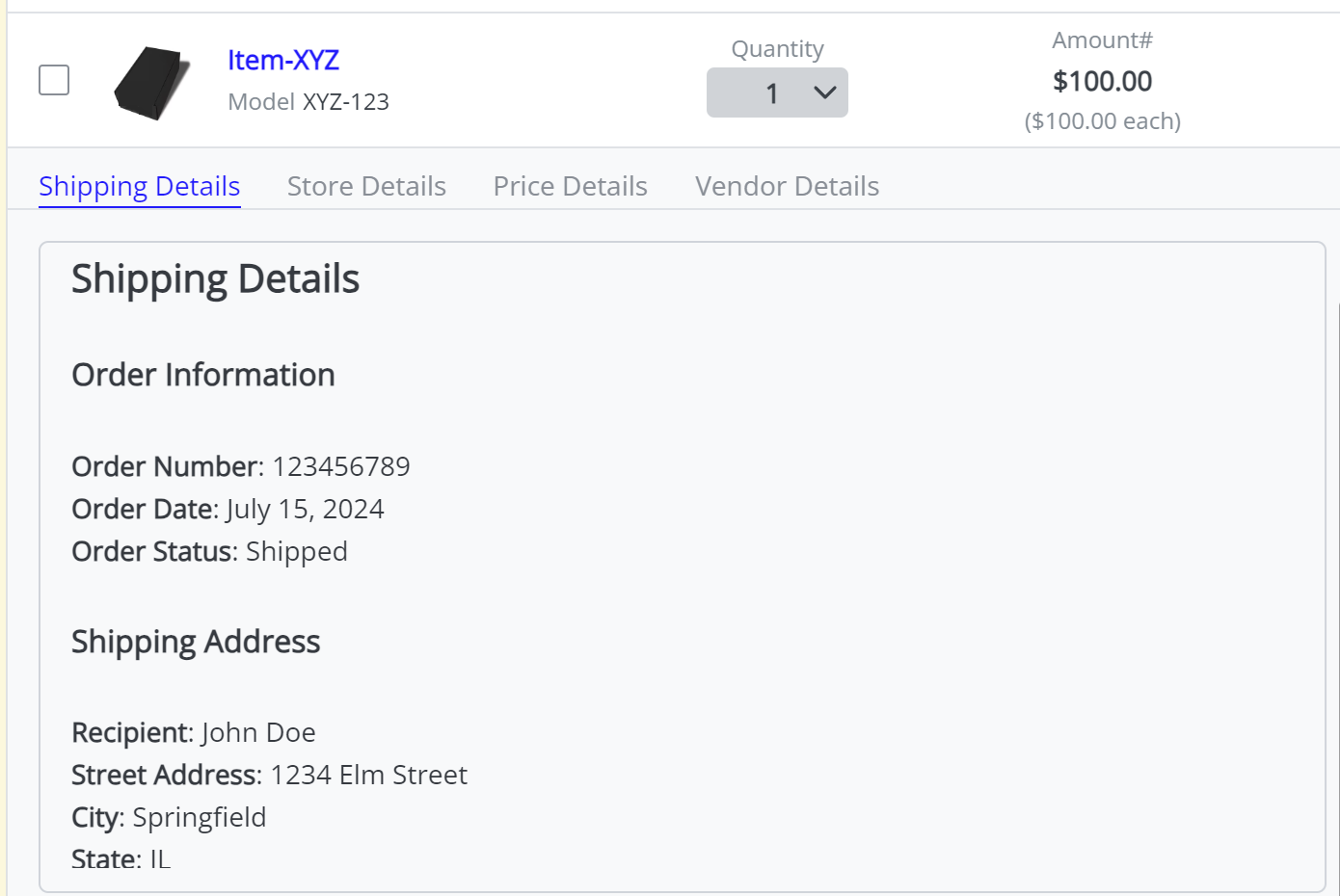
Item Details tab view:
Example
{
"id": 'advanced_selector',
"title": 'Advanced Selector',
"component": 'advanced_selector',
"instructions": 'Advanced Selector for selecting multiple values',
"required": true,
"default_value": [],
"value_format": "short",
"allow_custom": true,
"selections": [
{
"value": "AZ-12345",
"selection_display_elements": [
{
"type": "label_value",
"label": "Order#",
"value": "AZ-12345",
"column_width": 1,
"text_shade": "feature",
"column_align": "left",
},
{
"type": "label_value",
"label": "Date",
"value": "2020-11-11",
"column_width": 1,
"text_shade": "standard",
"column_align": "left",
},
{
"type": "label_value",
"label": "Fulfillment",
"value": "Dropship",
"column_width": 1,
"text_shade": "standard",
},
{
"type": "label_value",
"label": "Status",
"value": "Delivered",
"column_width": 1,
"text_shade": "standard",
"column_align": "left",
},
{
"type": "label_value",
"label": "Customer Name",
"value": "Melody Arc",
"column_width": 1,
"text_shade": "standard",
},
{
"type": "label_value",
"label": "City, State",
"value": "New York, NY",
"column_width": 2,
"text_shade": "standard",
"column_align": "left",
},
{
"type": "label_value",
"label": "Amount",
"value": "$100.00",
"column_width": 2,
"text_shade": "standard",
},
],
"items": [
{
"value": "abc123",
"item_display_elements": [
{
"type": "image",
"src": "https://res.cloudinary.com/drinklmnt/image/upload/f_auto,q_auto,w_280/v1693440316/lmnt-insider-bundle-closed-small_qoiqow.webp"
},
{
"type": "header_with_details",
"header": "Item-XYZ",
"detail_1": {"key": "Model", "value": "XYZ-123"},
"detail_2": {"key": "Model", "value": "XYZ-123"},
"detail_3": {"key": "Model", "value": "XYZ-123"},
},
{
"type": "quantity_selector",
"quantity": '0',
"quantity_options": ['0','1', '2', '3', '4','5', '6', '7', '8', '9', '10'],
"disabled": false
},
{
"type": "label_value",
"label": "Amount#",
"value": "$100.00",
"sub_value": "($100.00 each)",
"column_align": "center",
}
],
"item_details": [
{"name": "Shipping Details", "detail_markdown": "# Hello World\nThis is the Shipping Details Section"},
{"name": "Store Details", "detail_markdown": "# Hello World\nThis is the Store Details Section"},
{"name": "Price Details", "detail_markdown": "# Hello World\nThis is the Price Details Section"},
{"name": "Vendor Details", "detail_markdown": "# Hello World\nThis is the Vendor Details Section"},
],
},
{
"value": "56372819",
"item_display_elements": [
{
"type": "image",
"image_url": "https://res.cloudinary.com/drinklmnt/image/upload/f_auto,q_auto,w_280/v1693440316/lmnt-insider-bundle-closed-small_qoiqow.webp"
},
{
"type": "header_with_details",
"header": "Item-ABC",
"detail_1": {"key": "Model", "value": "ABC-456"}
},
{
"type": "quantity_selector",
"quantity": '2',
"quantity_options": ['0','1', '2', '3', '4','5', '6', '7', '8', '9', '10'],
"disabled": false
},
{
"type": "label_value",
"label": "Amount#",
"value": "$50.00",
"sub_value": "($25.00 each)",
"column_align": "center",
}
],
"item_details": [
{"name": "Shipping Details", "detail_markdown": "# Hello World\nThis is the Shipping Details Section"},
{"name": "Store Details", "detail_markdown": "# Hello World\nThis is the Store Details Section"},
{"name": "Price Details", "detail_markdown": "# Hello World\nThis is the Price Details Section"},
{"name": "Vendor Details", "detail_markdown": "# Hello World\nThis is the Vendor Details Section"},
],
},
{
"value": "82736491",
"item_display_elements": [
{
"type": "image",
"image_url": "https://res.cloudinary.com/drinklmnt/image/upload/f_auto,q_auto,w_280/v1693440316/lmnt-insider-bundle-closed-small_qoiqow.webp"
},
{
"type": "header_with_details",
"header": "Item-DEF",
"detail_1": {"key": "Model", "value": "DEF-789"}
},
{
"type": "quantity_selector",
"quantity": '1',
"quantity_options": ['0','1', '2', '3', '4','5', '6', '7', '8', '9', '10'],
"disabled": true
},
{
"type": "label_value",
"label": "Amount#",
"value": "$75.00",
"sub_value": "($75.00 each)",
"column_align": "center",
}
],
"item_details": [
{"name": "Shipping Details", "detail_markdown": "# Hello World\nThis is the Shipping Details Section"},
{"name": "Store Details", "detail_markdown": "# Hello World\nThis is the Store Details Section"},
{"name": "Price Details", "detail_markdown": "# Hello World\nThis is the Price Details Section"},
{"name": "Vendor Details", "detail_markdown": "# Hello World\nThis is the Vendor Details Section"},
],
},
{
"value": "38475926",
"item_display_elements": [
{
"type": "image",
"image_url": "https://res.cloudinary.com/drinklmnt/image/upload/f_auto,q_auto,w_280/v1693440316/lmnt-insider-bundle-closed-small_qoiqow.webp"
},
{
"type": "header_with_details",
"header": "Item-GHI",
"detail_1": {"key": "Model", "value": "GHI-012"}
},
{
"type": "quantity_selector",
"quantity_options": ['0','1', '2', '3', '4','5', '6', '7', '8', '9', '10'],
"quantity": '3',
"disabled": false
},
{
"type": "label_value",
"label": "Amount#",
"value": "$30.00",
"sub_value": "($10.00 each)",
"column_align": "center",
}
],
"item_details": [
{"name": "Shipping Details", "detail_markdown": "# Hello World\nThis is the Shipping Details Section"},
{"name": "Store Details", "detail_markdown": "# Hello World\nThis is the Store Details Section"},
{"name": "Price Details", "detail_markdown": "# Hello World\nThis is the Price Details Section"},
{"name": "Vendor Details", "detail_markdown": "# Hello World\nThis is the Vendor Details Section"},
],
},
{
"value": "92736485",
"item_display_elements": [
{
"type": "image",
"image_url": "https://res.cloudinary.com/drinklmnt/image/upload/f_auto,q_auto,w_280/v1693440316/lmnt-insider-bundle-closed-small_qoiqow.webp"
},
{
"type": "header_with_details",
"header": "Item-JKL",
"detail_1": {"key": "Model", "value": "JKL-345"}
},
{
"type": "quantity_selector",
"quantity_options": ['0','1', '2', '3', '4','5', '6', '7', '8', '9', '10'],
"quantity": 1,
"disabled": false
},
{
"type": "label_value",
"label": "Amount#",
"value": "$150.00",
"sub_value": "($150.00 each)",
"column_align": "center",
}
],
"item_details": [
{"name": "Shipping Details", "detail_markdown": "# Hello World\nThis is the Shipping Details Section"},
{"name": "Store Details", "detail_markdown": "# Hello World\nThis is the Store Details Section"},
{"name": "Price Details", "detail_markdown": "# Hello World\nThis is the Price Details Section"},
{"name": "Vendor Details", "detail_markdown": "# Hello World\nThis is the Vendor Details Section"},
],
}
],
},
{
"value": "ZY-98765",
"selection_display_elements": [
{
"type": "label_value",
"label": "Order#",
"value": "A95628904",
"column_width": 1,
"text_shade": "feature",
"column_align": "left",
},
{
"type": "label_value",
"label": "Date",
"value": "2020-11-11",
"column_width": 1,
"text_shade": "standard",
"column_align": "left",
},
{
"type": "label_value",
"label": "Fulfillment",
"value": "Dropship",
"column_width": 1,
"text_shade": "standard",
},
{
"type": "label_value",
"label": "Status",
"value": "Delivered",
"column_width": 1,
"text_shade": "standard",
"column_align": "left",
},
{
"type": "label_value",
"label": "Customer Name",
"value": "Melody Arc",
"column_width": 1,
"text_shade": "standard",
},
{
"type": "label_value",
"label": "City, State",
"value": "New York, NY",
"column_width": 2,
"text_shade": "standard",
"column_align": "left",
},
{
"type": "label_value",
"label": "Amount",
"value": "$100.00",
"column_width": 2,
"text_shade": "standard",
},
],
"items": [
{
"value": "abc123",
"item_display_elements": [
{
"type": "image",
"src": "https://res.cloudinary.com/drinklmnt/image/upload/f_auto,q_auto,w_280/v1693440316/lmnt-insider-bundle-closed-small_qoiqow.webp"
},
{
"type": "header_with_details",
"header": "Item-XYZ",
"detail_1": {"key": "Model", "value": "XYZ-123"}
},
{
"type": "quantity_selector",
"quantity_options": ['0','1', '2', '3', '4','5', '6', '7', '8', '9', '10'],
"quantity": 1,
"disabled": false
},
{
"type": "label_value",
"label": "Amount#",
"value": "$100.00",
"sub_value": "($100.00 each)",
"column_align": "center",
}
],
"item_details": [
{
"name": "Shipping Details",
"detail_markdown": "# Shipping Details\n\n## Order Information\n\n- **Order Number**: 123456789\n- **Order Date**: July 15, 2024\n- **Order Status**: Shipped\n\n## Shipping Address\n\n- **Recipient**: John Doe\n- **Street Address**: 1234 Elm Street\n- **City**: Springfield\n- **State**: IL\n- **Zip Code**: 62704\n- **Country**: USA\n\n## Package Information\n\n- **Carrier**: UPS\n- **Tracking Number**: 1Z9999999999999999\n- **Estimated Delivery Date**: July 20, 2024\n\n## Items Shipped\n\n1. **Product**: Wireless Headphones\n - **Quantity**: 1\n - **Price**: $99.99\n2. **Product**: USB-C Charger\n - **Quantity**: 2\n - **Price**: $19.99 each\n\n## Additional Notes\n\nPlease ensure someone is available to receive the package at the delivery address. If you have any questions or concerns, feel free to contact our customer support.\n\n## Contact Information\n\n- **Customer Support**: [email protected]\n- **Phone**: 1-800-123-4567\n\nThank you for shopping with us!"
},
{"name": "Store Details", "detail_markdown": "# Hello World\nThis is the Store Details Section"},
{"name": "Price Details", "detail_markdown": "# Hello World\nThis is the Price Details Section"},
{"name": "Vendor Details", "detail_markdown": "# Hello World\nThis is the Vendor Details Section"},
],
},
{
"value": "56372819",
"item_display_elements": [
{
"type": "image",
"image_url": "https://res.cloudinary.com/drinklmnt/image/upload/f_auto,q_auto,w_280/v1693440316/lmnt-insider-bundle-closed-small_qoiqow.webp"
},
{
"type": "header_with_details",
"header": "Item-ABC",
"detail_1": {"key": "Model", "value": "ABC-456"}
},
{
"type": "quantity_selector",
"quantity_options": ['0','1', '2', '3', '4','5', '6', '7', '8', '9', '10'],
"quantity": 2,
"disabled": false
},
{
"type": "label_value",
"label": "Amount#",
"value": "$50.00",
"sub_value": "($25.00 each)",
"column_align": "center",
}
],
"item_details": [
{"name": "Shipping Details", "detail_markdown": "# Hello World\nThis is the Shipping Details Section"},
{"name": "Store Details", "detail_markdown": "# Hello World\nThis is the Store Details Section"},
{"name": "Price Details", "detail_markdown": "# Hello World\nThis is the Price Details Section"},
{"name": "Vendor Details", "detail_markdown": "# Hello World\nThis is the Vendor Details Section"},
],
},
{
"value": "82736491",
"item_display_elements": [
{
"type": "image",
"image_url": "https://res.cloudinary.com/drinklmnt/image/upload/f_auto,q_auto,w_280/v1693440316/lmnt-insider-bundle-closed-small_qoiqow.webp"
},
{
"type": "header_with_details",
"header": "Item-DEF",
"detail_1": {"key": "Model", "value": "DEF-789"}
},
{
"type": "quantity_selector",
"quantity_options": ['0','1', '2', '3', '4','5', '6', '7', '8', '9', '10'],
"quantity": 1,
"disabled": true
},
{
"type": "label_value",
"label": "Amount#",
"value": "$75.00",
"sub_value": "($75.00 each)",
"column_align": "center",
}
],
"item_details": [
{"name": "Shipping Details", "detail_markdown": "# Hello World\nThis is the Shipping Details Section"},
{"name": "Store Details", "detail_markdown": "# Hello World\nThis is the Store Details Section"},
{"name": "Price Details", "detail_markdown": "# Hello World\nThis is the Price Details Section"},
{"name": "Vendor Details", "detail_markdown": "# Hello World\nThis is the Vendor Details Section"},
],
},
{
"value": "38475926",
"item_display_elements": [
{
"type": "image",
"image_url": "https://res.cloudinary.com/drinklmnt/image/upload/f_auto,q_auto,w_280/v1693440316/lmnt-insider-bundle-closed-small_qoiqow.webp"
},
{
"type": "header_with_details",
"header": "Item-GHI",
"detail_1": {"key": "Model", "value": "GHI-012"}
},
{
"type": "quantity_selector",
"quantity_options": ['0','1', '2', '3', '4','5', '6', '7', '8', '9', '10'],
"quantity": 3,
"disabled": false
},
{
"type": "label_value",
"label": "Amount#",
"value": "$30.00",
"sub_value": "($10.00 each)",
"column_align": "center",
}
],
"item_details": [
{"name": "Shipping Details", "detail_markdown": "# Hello World\nThis is the Shipping Details Section"},
{"name": "Store Details", "detail_markdown": "# Hello World\nThis is the Store Details Section"},
{"name": "Price Details", "detail_markdown": "# Hello World\nThis is the Price Details Section"},
{"name": "Vendor Details", "detail_markdown": "# Hello World\nThis is the Vendor Details Section"},
],
},
{
"value": "92736485",
"item_display_elements": [
{
"type": "image",
"image_url": "https://res.cloudinary.com/drinklmnt/image/upload/f_auto,q_auto,w_280/v1693440316/lmnt-insider-bundle-closed-small_qoiqow.webp"
},
{
"type": "header_with_details",
"header": "Item-JKL",
"detail_1": {"key": "Model", "value": "JKL-345"}
},
{
"type": "quantity_selector",
"quantity_options": ['0','1', '2', '3', '4','5', '6', '7', '8', '9', '10'],
"quantity": 1,
"disabled": false
},
{
"type": "label_value",
"label": "Amount#",
"value": "$150.00",
"sub_value": "($150.00 each)",
"column_align": "center",
}
],
"item_details": [
{"name": "Shipping Details", "detail_markdown": "# Hello World\nThis is the Shipping Details Section"},
{"name": "Store Details", "detail_markdown": "# Hello World\nThis is the Store Details Section"},
{"name": "Price Details", "detail_markdown": "# Hello World\nThis is the Price Details Section"},
{"name": "Vendor Details", "detail_markdown": "# Hello World\nThis is the Vendor Details Section"},
],
}
],
},
]
}Note: The example demonstrates the usage of the Advanced Selector with the specified properties
Updated 2 months ago