
Dynamic Forms
Using XML-like Domain Specific Language (DSL) to create forms
Dynamic Forms (XML DSL) —
The XML domain-specific language (DSL) is the current primary method for building Form Builder components. It lets you define rich, interactive forms as a compact XML string — no component configuration objects required. The DSL renders into fully functional UI components that respond to associate input in real time.
Where DSL forms render
DSL forms can be targeted to three UI surfaces:
| Surface | Description |
|---|---|
| MACIE Chat Thread | Inline within the AI Operator's conversation with the associate |
| Action Panel | The right-hand panel in the associate workspace |
| Task Action Drop Down | Contextual actions available within a task |
How it works
DSL markup is embedded in the instructions field of a Form Builder page — the platform renders it as a live interactive component within the surrounding Form Builder UI. This remains the standard pattern until Form Builder is fully deprecated in 2026 (see Legacy Form Builder below). DSL can also be used in any other Form Builder component, either within invoke point attributes or directly in code points.
The example below shows a complete invoke_component Point. The DSL is passed as the instructions value on a page, and associate-provided values are mapped back to the data token via invoke_data_token.
DSL basics
The DSL uses XML-like tags that map to Mantine UI components. Tags use the explicit core: namespace prefix. Dynamic values from the AI Operator's execution context are interpolated using ${} syntax.
State binding — attach any input to a state path using path. The associate's input is read from and written to that path automatically:
<core:textInput label="Email" path="form.email" />
<core:select label="Priority" path="form.priority" data='[{"value":"high","label":"High"},{"value":"low","label":"Low"}]' />
Conditional rendering — show or hide elements based on current state:
<core:if path="form.allow_send" equals="no">
  <core:textarea label="Reason" path="form.rejection_reason" withAsterisk="true" />
</core:if>
Initial values — seed state from markup, with optional mode="unset" to only apply if the path has no value yet:
<state:set path="form.status" value="pending" />
<state:set path="form.notes" value="${operator_notes}" mode="unset" />
Dynamic variable interpolation — inject values from the AI Operator's execution context directly into the markup:
<core:text size="sm">${message_body}</core:text>Layout — compose with cards, stacks, grids, and groups:
<core:card>
  <core:stack gap="md">
    <core:grid gutter="md">
      <core:gridCol span='{"base":12,"md":6}'>
        <core:textInput label="First name" path="form.firstName" />
      </core:gridCol>
      <core:gridCol span='{"base":12,"md":6}'>
        <core:textInput label="Last name" path="form.lastName" />
      </core:gridCol>
    </core:grid>
  </core:stack>
</core:card>
DSL AI Prompt to Speed Building
## Markup XMLish Guide

This system renders a small “XMLish” language into React components (Mantine + safe HTML). You write markup like HTML, but with a curated set of tags and attributes.

It supports:

* Mantine components (recommended defaults)
* Safe HTML tags (optional, if enabled)
* Data binding to a state object (`path="form.name"`)
* Basic control flow: `if` and `each`
* State initialization via `state:set`

### Domains (usually omitted)

Most users should write **domain-less** tags:

```xml
<card>...</card>
<stack gap="md">...</stack>
<textInput path="form.name" />
```

When no domain is provided, the renderer resolves tags in this order:

1. `html:<tag>` (native tags like `div`, `hr`, `a`)
2. `core:<tag>` (Mantine-backed tags like `card`, `stack`, `textInput`)

You can still use explicit domains when needed:

```xml
<html:div>...</html:div>
<core:card>...</core:card>
```

---

## 1) State binding (`path`)

Most form components support a `path` attribute that binds them to `runtime.state`.

* **Read:** component value is read from `state` at that path
* **Write:** user changes update `state` at that same path

Example:

```xml
<textInput label="Name" path="form.name" />
<checkbox label="Subscribe" path="form.subscribe" />
```

This yields a state shape like:

```js
{
  form: {
    name: "Ada",
    subscribe: true
  }
}
```

### `id` shortcut (optional)

Some controls can support `id="name"` as shorthand for `path="form.name"`:

```xml
<textInput id="name" label="Name" />
```

---

## 2) Initial state (`state:set`)

Use `<state:set>` to seed initial values directly from markup.

### Attribute form (recommended)

```xml
<state:set path="form.name" value="Ada Lovelace" />
<state:set path="form.subscribe" value="false" />
<state:set path="form.confidence" value="50" />
```

### Child text form (useful for JSON)

```xml
<state:set path="form.tags">
  ["ts","react","mantine"]
</state:set>
```

### Mode (optional)

If supported, `mode="unset"` only sets the value if it isn’t already defined (handy for playgrounds):

```xml
<state:set path="form.name" value="Ada" mode="unset" />
```

---

## 3) Control flow

### `if`

Conditionally render children based on a bound value.

```xml
<if path="form.subscribe" truthy="true">
  <text size="sm">Thanks for subscribing!</text>
</if>
```

Supported checks:

* `exists="true|false"`: checks undefined/null vs present
* `equals="..."`: compares against a coerced value
* `truthy="true|false"`: truthiness check (default behavior if none provided)

Examples:

```xml
<if path="form.plan" equals="pro">
  <badge>Pro features enabled</badge>
</if>

<if path="form.name" exists="true">
  <text>Hello!</text>
</if>
```

### `each`

Loop over an array from state and render children for each item.

```xml
<each path="form.items" as="item" index="i">
  <text size="sm">Item row</text>
</each>
```

Notes:

* `path` must resolve to an array
* `as` sets the item variable name inside scope
* `index` optionally exposes the index

---

## 4) Layout basics (Mantine-backed)

Common layout tags (depending on your registry):

* `<card>`, `<stack>`, `<group>`, `<grid>`, `<gridCol>`, `<divider>`

Example:

```xml
<card>
  <stack gap="md">
    <text fw="700">Profile</text>

    <grid gutter="md">
      <gridCol span='{"base":12,"md":6}'>
        <textInput label="First name" path="form.firstName" />
      </gridCol>

      <gridCol span='{"base":12,"md":6}'>
        <textInput label="Last name" path="form.lastName" />
      </gridCol>
    </grid>
  </stack>
</card>
```

---

## 5) Form controls

### Text-like inputs

```xml
<textInput label="Name" path="form.name" />
<textarea label="Bio" path="form.bio" />
<passwordInput label="Password" path="form.password" />
```

### Boolean controls

```xml
<checkbox label="Subscribe" path="form.subscribe" />
<switch label="Enable feature" path="form.featureEnabled" />
```

### Select / choice controls

```xml
<select
  label="Favorite language"
  path="form.language"
  data='[
    {"value":"ts","label":"TypeScript"},
    {"value":"py","label":"Python"}
  ]'
/>

<radioGroup label="Plan" path="form.plan">
  <radio value="free" label="Free" />
  <radio value="pro" label="Pro" />
</radioGroup>
```

### Sliders / numeric controls

```xml
<numberInput label="Age" path="form.age" min="0" max="120" />
<slider label="Confidence" path="form.confidence" min="0" max="100" step="5" />
```

### Color controls

```xml
<colorInput label="Theme color" path="form.color" format="hex" />
```

---

## 6) Overlays (Drawer / Modal) with auto-close

If your registry supports `opened="some.path"` as a path binding and auto-wires `onClose`, you can do:

```xml
<state:set path="ui.drawerOpen" value="false" />

<checkbox label="Open settings" path="ui.drawerOpen" />

<drawer title="Settings" opened="ui.drawerOpen" position="right" size="md">
  <stack gap="sm">
    <text size="sm" c="dimmed">Close via X / ESC / overlay.</text>
    <textInput label="Name" path="form.name" />
    <checkbox label="Enable feature" path="form.featureEnabled" />
  </stack>
</drawer>
```

* Starts closed (`ui.drawerOpen=false`)
* Checkbox toggles it
* The **X / ESC / overlay click** closes it by setting the same path to `false` (if your registry adds `onClose`)

---

## 7) HTML tags (optional)

If enabled via registry (`html:div`, `html:a`, `html:hr`, etc.), you can write:

```xml
<div style='{"padding":8}'>
  <hr />
  <a href="https://example.com" target="_blank">External link</a>
</div>
```

Security note:

* Keep allowed props tight.
* Avoid allowing event handler props (`onClick`, `onChange`, etc.) from markup.
* Avoid `dangerouslySetInnerHTML`.
* Sanitize `href` to block `javascript:` URLs.

---

## 8) Full example (showcases features)

```xml
<card>
  <state:set path="form.name" value="Ada Lovelace" />
  <state:set path="form.subscribe" value="true" />
  <state:set path="ui.drawerOpen" value="false" />

  <stack gap="md">
    <group justify="space-between">
      <text fw="700">Playground</text>
      <checkbox label="Open drawer" path="ui.drawerOpen" />
    </group>

    <grid gutter="md">
      <gridCol span='{"base":12,"md":7}'>
        <stack gap="md">
          <textInput label="Name" path="form.name" />

          <checkbox label="Subscribe" path="form.subscribe" />

          <if path="form.subscribe" truthy="true">
            <slider label="Confidence" path="form.confidence" min="0" max="100" step="5" />
          </if>
        </stack>
      </gridCol>

      <gridCol span='{"base":12,"md":5}'>
        <card withBorder="true">
          <stack gap="xs">
            <text fw="600">Conditional panel</text>
            <if path="form.name" exists="true">
              <text size="sm">Name is set ✅</text>
            </if>
            <if path="form.name" exists="false">
              <text size="sm">Name is empty ❌</text>
            </if>
          </stack>
        </card>
      </gridCol>
    </grid>

    <drawer title="Settings" opened="ui.drawerOpen" position="right" size="md">
      <stack gap="sm">
        <text size="sm" c="dimmed">Close via X / ESC / overlay.</text>
        <textInput label="Name" path="form.name" />
      </stack>
    </drawer>
  </stack>
</card>
```

---

## 9) Troubleshooting

### “Nothing renders”

Common causes:

* Unknown tag (not in registry)
* Tag not allowed under its parent (if you enforce `allowedParents`)
* You’re in non-strict mode and invalid nodes are being dropped

Tips:

* Temporarily enable strict mode and add an `onError` handler to surface validation errors.
* If you prefer exceptions in dev/tests, use `options={{ strict: true, throwOnError: true }}`.

### “Value not binding”

* Ensure the component registry entry includes `path` (and/or `id`) in `allowedProps`.
* Ensure `mapProps` wires `value/checked` + `onChange` correctly for that Mantine component’s signature.

---

More docs:
- `DEV_USAGE.md`
- `COMPONENTS.md`
- `MAINTAINER_GUIDE.md`
- `TESTING.md`
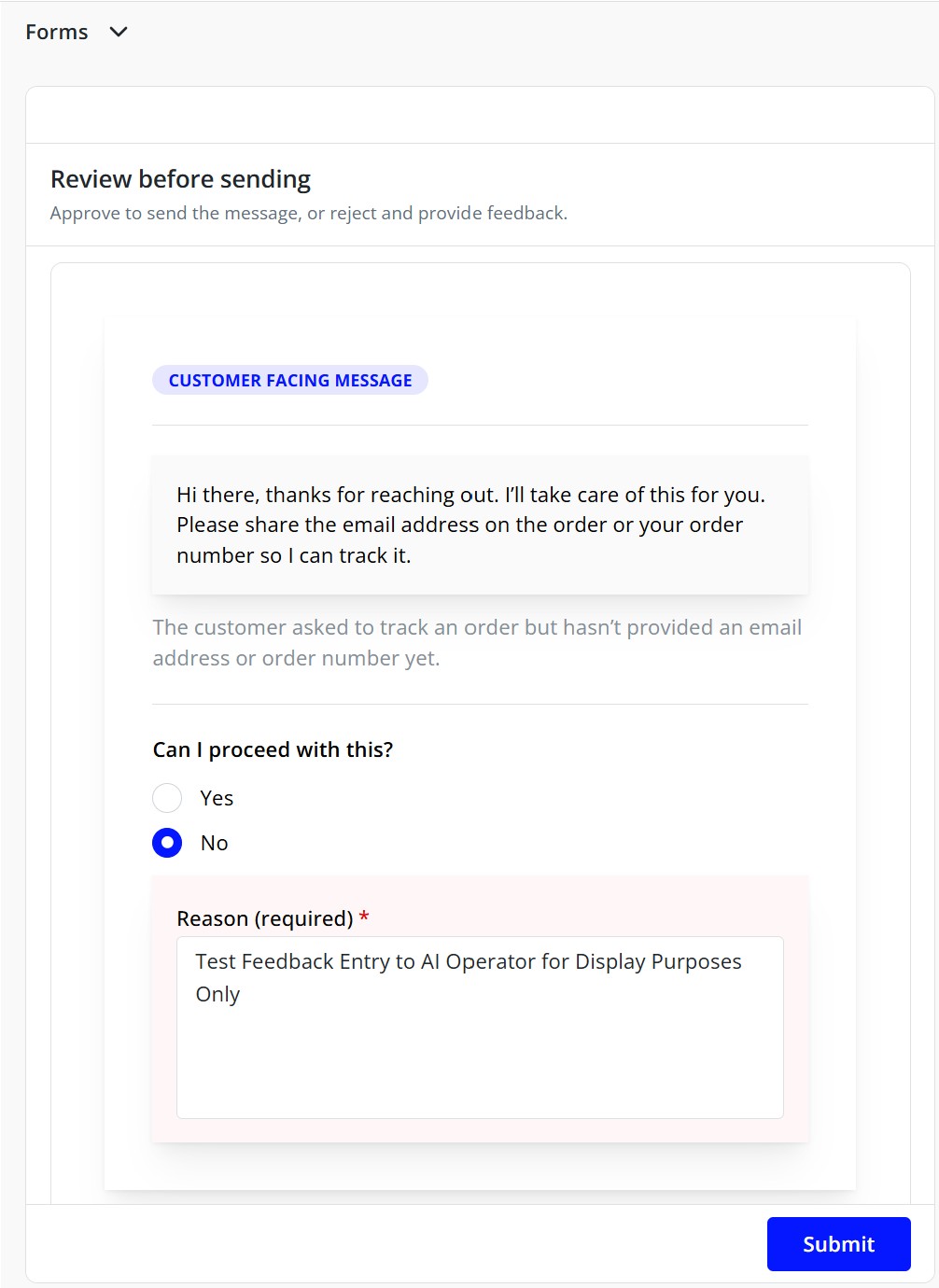
DSL example
The screenshot above is produced by the following DSL. It demonstrates the core patterns: state initialization, dynamic variable interpolation via ${}, conditional rendering, and two-way input binding via path. Note that the DSL uses explicit core: namespace prefixes, which is the standard convention.
<core:card padding="lg">
  <state:set path="form.allow_send" value="yes" />
  <state:set path="form.message_rejection_reason" value="" mode="unset" />
  <state:set path="form.message_header" value="${internal_only}" mode="unset" />

  <core:paper
    withBorder="false"
    radius="0"
    p="xl"
    shadow="md"
    style='{
      "background":"#ffffff",
      "border":"1px solid rgba(0,0,0,0.08)",
      "boxShadow":"0 14px 40px rgba(0,0,0,0.10)"
    }'
  >
    <core:stack gap="lg">

      <core:stack gap="xs">
        <core:badge variant="light" color="blue" style='{"width":"fit-content"}'>
          <core:if path="form.message_header" equals="no">
            Customer Facing Message
          </core:if>
          <core:if path="form.message_header" equals="yes">
            Internal Workflow Message
          </core:if>
        </core:badge>
      </core:stack>

      <core:divider style='{"opacity":0.65}' />

      <core:stack gap="sm">
        <core:paper
          radius="0"
          p="md"
          style='{
            "background":"rgba(0,0,0,0.02)",
            "border":"1px solid rgba(0,0,0,0.06)"
          }'
        >
          <core:text size="sm" style='{"whiteSpace":"pre-wrap","lineHeight":"1.65"}'>
            ${message}
          </core:text>
        </core:paper>

        <core:text size="sm" c="dimmed" style='{"lineHeight":"1.55"}'>
          ${reason}
        </core:text>
      </core:stack>

      <core:divider style='{"opacity":0.65}' />

      <core:stack gap="sm">
        <core:text size="sm" fw="600">Can I proceed with this?</core:text>

        <core:radioGroup path="form.allow_send" withAsterisk="true">
          <core:stack gap="xs">
            <core:radio value="yes" label="Yes" size="md" />
            <core:radio value="no" label="No" size="md" />
          </core:stack>
        </core:radioGroup>

        <core:if path="form.allow_send" equals="no">
          <core:paper
            radius="0"
            p="md"
            style='{
              "background":"rgba(255, 0, 0, 0.03)",
              "border":"1px solid rgba(255, 0, 0, 0.12)"
            }'
          >
            <core:textarea
              label="Reason (required)"
              path="form.message_rejection_reason"
              withAsterisk="true"
              autosize="true"
              minRows="5"
              placeholder="Explain what needs to change (tone, facts, missing info, etc.)"
            />
          </core:paper>
        </core:if>
      </core:stack>

    </core:stack>
  </core:paper>
</core:card>
DSL JSON Object
{
  "organization_id": "org_YOUR_ORG_ID",
  "name": "collect_user_feedback",
  "partition": "op_skills",
  "description": "Collect structured feedback from the user via a form_builder UI",
  "tags": ["skill", "ui", "invoke_component", "operator:chat"],
  "inputs": {
    "task.operator": { "evaluate": "=chat" },
    "_this.status": { "evaluate": "=ready" },
    "_this.name": { "evaluate": "=collect_user_feedback" }
  },
  "attributes": {
    "friendly_name": "Collect user feedback",
    "invoke_pages": [
      {
        "header": "Quick Feedback",
        "instructions": "Please fill this out so I can help you better.",
        "fields": [
          {
            "id": "satisfaction",
            "title": "How satisfied are you?",
            "component": "radio_group",
            "instructions": "Choose one option.",
            "required": true,
            "default_value": "good",
            "options": [
              { "value": "great", "label": "Great" },
              { "value": "good", "label": "Good" },
              { "value": "ok", "label": "Okay" },
              { "value": "bad", "label": "Bad" }
            ]
          },
          {
            "id": "topic",
            "title": "What topic is this about?",
            "component": "select",
            "instructions": "Pick the closest match.",
            "required": true,
            "options": "@feedback_topics"
          },
          {
            "id": "details",
            "title": "Anything else you want to add?",
            "component": "text_area",
            "instructions": "Optional, but helpful.",
            "required": false
          }
        ]
      }
    ],
    "invoke_data_token": {
      "request.feedback.satisfaction": "satisfaction",
      "request.feedback.topic": "topic",
      "request.feedback.details": "details"
    },
    "add_keys": {
      "response.user_response": "Thanks — I've got your feedback.",
      "request.feedback.captured_by": "_this.name"
    }
  },
  "code": "invoke_component",
  "allow_taskless": false,
  "is_quicklink": false,
  "allow_dynamic_code": false,
  "allow_dynamic_key": false,
  "version": "latest",
  "search_resource_type": "invoke"
}
Legacy Form Builder
Form Builder is invoked from a code point using get_component(). The function returns a configuration object that defines what the associate sees — one or more pages, each with a header, instructions, and a set of named input fields. When the associate completes the form and submits, the platform writes their responses back to the data token using the data_token map, making those values available to the rest of the AI Operator's execution flow.
async function get_component() {
  return {
    component_name: "form_builder",
    friendly_name: _token.friendly_name,
    pages: [
      {
        header: "Confirm Action",
        instructions: "Review and confirm the details below.",
        fields: [
          {
            id: "disposition",
            title: "Proceed?",
            component: "radio_group",
            required: true,
            options: [
              { value: "confirm", label: "Yes, confirm" },
              { value: "cancel", label: "No, cancel" },
            ],
          },
        ],
      },
    ],
    data_token: {
      "temp.disposition": "disposition",
    },
  };
}
Each field declares a named component type that determines which UI element renders. The data_token maps each field's id to a path in the data token where its value will be written. friendly_name sets the label displayed in the associate's task pane.
get_component() and data_token are not going away. What is being retired in 2026 is the named component type system and the rigid page-and-fields structure it requires. The DSL replaces that layer with far more expressive, unconstrained markup. Until then, the component types below remain fully supported.